For those who haven’t noticed yet. Legacy Student Media has a new logo!
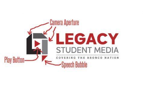
For the first time in Legacy Student Media history, we’ve redesigned, and our logo has a few secrets in it. We’re not the first institution to hide something in our logo. In fact, plenty of logos try to get their message across subtly.
LEGACY STUDENT MEDIA
MILWAUKEE BREWERS – MLB TEAM (Used 1978-1993)
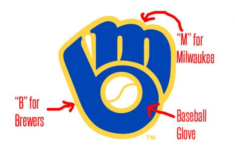
The Milwaukee Brewers have one of the best logos with hidden meanings, and one of the nicest logos in sports. At a glance, their logo looks like a baseball glove, but on closer inspection, you can see the “M” and “B” for Milwaukee Brewers, which makes up the glove.
FEDEX
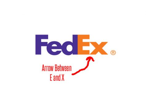
Fedex might have the worst kept secret in their logo, with the E and X meeting together to form an arrow, because shipping.
TOUR DE FRANCE
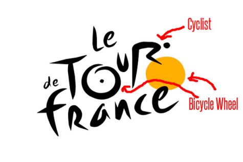
Other than being the most famous bike race in the world, the Tour de France has a very interesting logo with the letters joining together to form a cyclist.
AMAZON
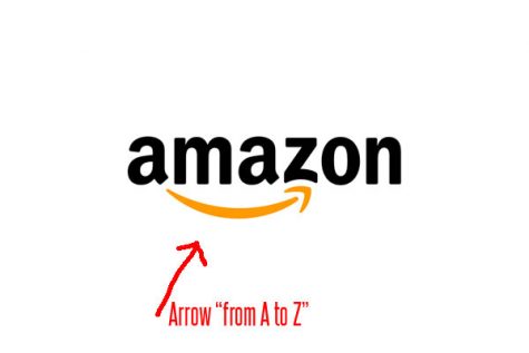
Normally, Amazon’s logo looks pretty uninspired and pretty uninteresting. But the Amazon logo actually works more as a statement than anything, showing how the company has everything “from A to Z.”
Next time you look at a company logo (including our NEW logo), look closely because there might be something hidden inside.


